Properties
The UI Dropdown component comes with quite a few properties that allow for easy customisation.
| Property Name | Description |
|---|---|
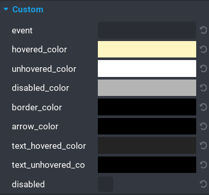
event |
A unique event can be set for broadcasting and listening. See the Events section for more information. |
hovered_color |
The color of the dropdown and its options when the mouse is hovered over them. |
unhovered_color |
The color of the dropdown and its options when the mouse moves off them. This is the default color. |
disabled_color |
The color of the dropdown when it is disabled. |
border_color |
The color of the border around the dropdown and options panel. |
arrow_color |
The color of the arrow in the dropdown. |
text_hovered_color |
The color of the dropdown and options text when the mouse is hovered over them. |
text_unhovered_color |
The color of the dropdown and its options when the mouse moves off them. This is the default color. |
disabled |
(boolean) If enabled then the dropdown will be disabled at runtime. |